Our Firts Graffiti Act
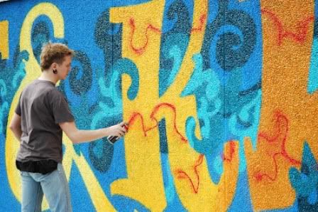
Finally! We made our first graffiti! It was part of the voluntary progam together with NLDoet. Dutch graffiti artist/illustrator Jord Jansen guided us throughout the process. Check out the full story on the post!
Photo Moodle
To celebrate the awesomeness of emotional design, we invite you to join our newest project : Photo Moodle! (Moody Doodle). Here's bit by bit on how you can join us!
The Canned Goods
Danish artist created more than 70 different cans consist of intangible things, moods, and traits, such as well-being, openness, and unconditional love.
The Look and Feel of Typography
What is one of the essential parts of a good design, which contains writings? Of course it is the 'typography'. Can typography really define the mood? Let's have a closer look at the interesting examples to get inspired!
Rip up to create
Have you ever been punished in childhood for accidentally ripping up you Dad's favorite newspaper or Mom's magazine ? it's not a crime any more! It's design and even more. It is art.
Friday, March 30, 2012
Thursday, March 29, 2012
6 World Famous Design Awards
- architecture
- interior design
- products
- fashion
- graphic design
Entry Title: "The Royal Wedding"
Name: Jonas Lundin, Sven R Ohlson, Jonas Moberg, Cia Axelsson, Sweden
Company: Love for Art & Business
Category: Multimedia, Professional
Name: Colin Seah, Kevin Leong, Roberto Rivera, Lolleth Alejandro, Sacharissa Kurniawan, Singapore
Company: Ministry of Design
Category: Interior Design, Professional
- Public space
- Habitat
- Mobility
- Energy
- Green
- Bathroom
- Domestic Aid
- Interrior Accesories
- Illumination
- Home Furniture
- Productivity
- Workplace
- Protection
- Life Science
- Third Age
- Interaction & Communication
- Mobile Lifestyle
- Entertainment
- Fashion
- Education
- Recreation
- Communication
- best design digital media
- best motion design
- best graphic design
- Product
- best industrial product
- best consumer product
- Spatial design
- best private interior
- best public exterior
- best product public space
- Autonomous - the new one, established just this year. The design and development of the product may be commissioned but the product should always be imbued with the designer's personal themes.
- The golden eye - ‘overall' prize will be awarded to the most successful designer or design bureau of the year.
- Public award - Since 2011 the public can choose their favorite out of all entries.
- Mini young designer award - young, talented designers and graduates
- Best client award - aims to focus the attention on an excellent relationship between a designer and a commissioning client.
- BNO PIET zwart prize - is given to a designer who may be considered ‘beyond category' and who has made a ‘most significant' contribution to the design profession.

The creterias for judgement in 22 categories are the following:
- Innovation: design, experience, manufacturing
- Benefit to User: performance, comfort, safety, usability, user interface, ergonomics and etc.
- Responsibility: Benefit to society, environment, culture and economy
- Benefit to the client: profitability, increased sales, brand reputation, employee morale
- Visual appeal and appropriate aesthetics
- Design Research: usability, emotional factors, unmet needs) testing rigor and reliability
- Design Strategy Category: strategic value and implementation
The Inspiron Duo is a convertible, premium Netbook PC that transforms into a Tablet PC, or maybe it’s a Tablet that transforms into a standard Netbook...
Nominations are represented in three areas, namely product, communication and packaging by 12 following categories:
- Consumer Electronics/Telecommunications
- Computers
- Office/Business
- Lighting
- Household/Residential
- Leisure/Lifestyle
- Industry/Buildings
- Medicine/Health+Care
- Public Design/Interior Design
- Transportation
- Advanced studies
- Packaging
HCBCzwei Verwaltung UG & Co ordered a concept for the three-floor cafe/bar/club in Hamburg represented in minimalistic style murging Eastern and Western tendencies.
Monday, March 19, 2012
How I became a street artist
The graffiti-creation was announced as a part of volunteer activity of NLDOET taking place on March 17th all over the Netherlands. Some were planting trees, some creating fancy road signs some (like us) were giving new life to old buildings (so unlike most of graffiti paintings this one was legal). The organisators of the event invited Jord Jansen a Dutch illustrator, artist, musician and graffiti painter to lead the project and to teach several volunteers the basics of street art.
Dutch "early birds" gathers 9.30 at the spot. A little bit familliar with Dutch culture I expected to start the work right away at 9.31. The first nice unexpected turn for me, as a lazy russian, was a cup of freshly made coffee in a company of future artists offered by the hosts. Few people were still late (they of course were internationals), so I was the only one non-dutch in a "gezellig" company trying to understand first advice and instructions given by Jord. After few cups of coffee we got a small excursion over the sport center, met a group of children sitting in splits, having their training. Apparently they entered the building with grey old walls in the morning and now they were looking at us, the strangers in old durty clothes as at homeless or beggars having no idea that in few hours their school will change it's appearence.
Well, finally it's time to start... I should say of course that the graffiti you ussualy see in the slums are made at night by one or two people so the experience we got is apparently not the same, but still facinating! Sunny Saturday morning, music playing outside, 15 people shaking the canns with paint (you should shake them at least 2 minutes before painting to make the paint inside homogenious and liquid). There are metal bolls in the cannes which help to shake the paint and the more you shake the louder is the sound they make. There were three boxes of painting sprays. There are two of them:
The future graffiti consept was designed few days before. It was decided that there will be a graffiti writing - the name of the sport center "Kunst&Kracht" which means "Art&Power" and figures of gymnasts on both sides of the writing. The figures were designed beforehand. On the night before painting, Jord with few helpers took the beamer outside, projected the pictures of gymnasts on the wall and copied them with a black marker on the wall.
The font of the writing was designs beforehand as well, however only the frame and the coloures were decided. As for the detailes we were improvisign and creating during the process as real artists as you will see later. Jord started making thin lines of the figures with a spray paint leting us to fiil in the figures. Later we'll realise how hard is it to keep the lines thin and neat.
We'll remove those strange "FDG" in the very end by making a flag with our names.
There was also made some graffiti before us, so we decided to to fit into the composition and to murge our figures with the exsisting painting by continuing the waves . That's what we got:
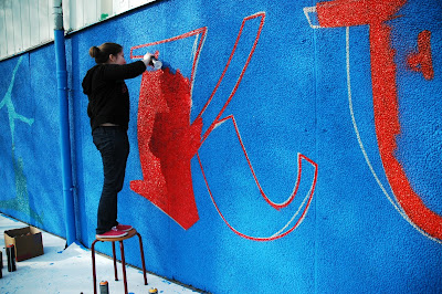
After the figures were ready we moved to the writing. There was no marker frame to follow, so jord just started paint the lines from nowhere looking at the printed letters from time to time.
When the aproximate frame with a white paint was ready it was time to make the lines with actual colours.
The whole palette from bloody red to banana yellow was chosen for the writing.
Every next letter was one tone lighter than the previouse one in word Kunts, "&" was the lightest yellow and the Kracht was again from yellow to bloody red every next character one tone darker.
After that we started making the fancy background for the writing which looked alike paisley pattern.
Some cracks effect with red paint inside the letters:
Finally it is time delineate the letters with black paint...
and with light green outside also... and some shadow inside as well :) So three time contour, signature and final picture.
To celebrate our awesome team-work we had lunch outdoors, discussing future paintings on nearby fence and made the final touch: the flag with the creators names.
Cheking the names with the list not to foget anyone:
The whole crew:
Tired but happy we can go home being proud of our powerful art.
Special thanks to Jord Jansen and to Sasha, one of the authors of the blog and resistant photographer.
PS: the day after when I found my right arm aching becouse of several hours of constant painting, I realised how hard is that kind of art :)
PPS: you are more than welcome to share you own experience or just your mood in the comments.
And if you have any questions left, feel free to ask! We'll be happy to tell more about our experience and process details.


